Improving member and employee satisfaction with filing claims
An improved digital experience for classic car insurance holders
THE CHALLENGE
A redesigned digital claim filing experience that allows members to provide necessary information without getting in their way.
THE SOLUTION
To create a digital experience to streamline the claim filing process for both members and employees.
ROLE
Product Design, User Research
TIMELINE
2022
Background
Hagerty is a niche insurance agency that specializes in coverage for classic cars. For insurance members, the primary opportunity for the business was to decrease the percentage of service actions completed by phone, mail, and chat from our current 46% to 41% of our overall service requests.
Our team was tasked with the responsibility of enabling members to perform policy management tasks online, in order to save time and effort both for members and employees.
One of the initiatives within our roadmap was to optimize the claims experience.
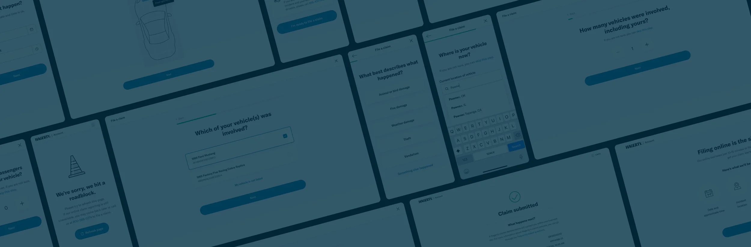
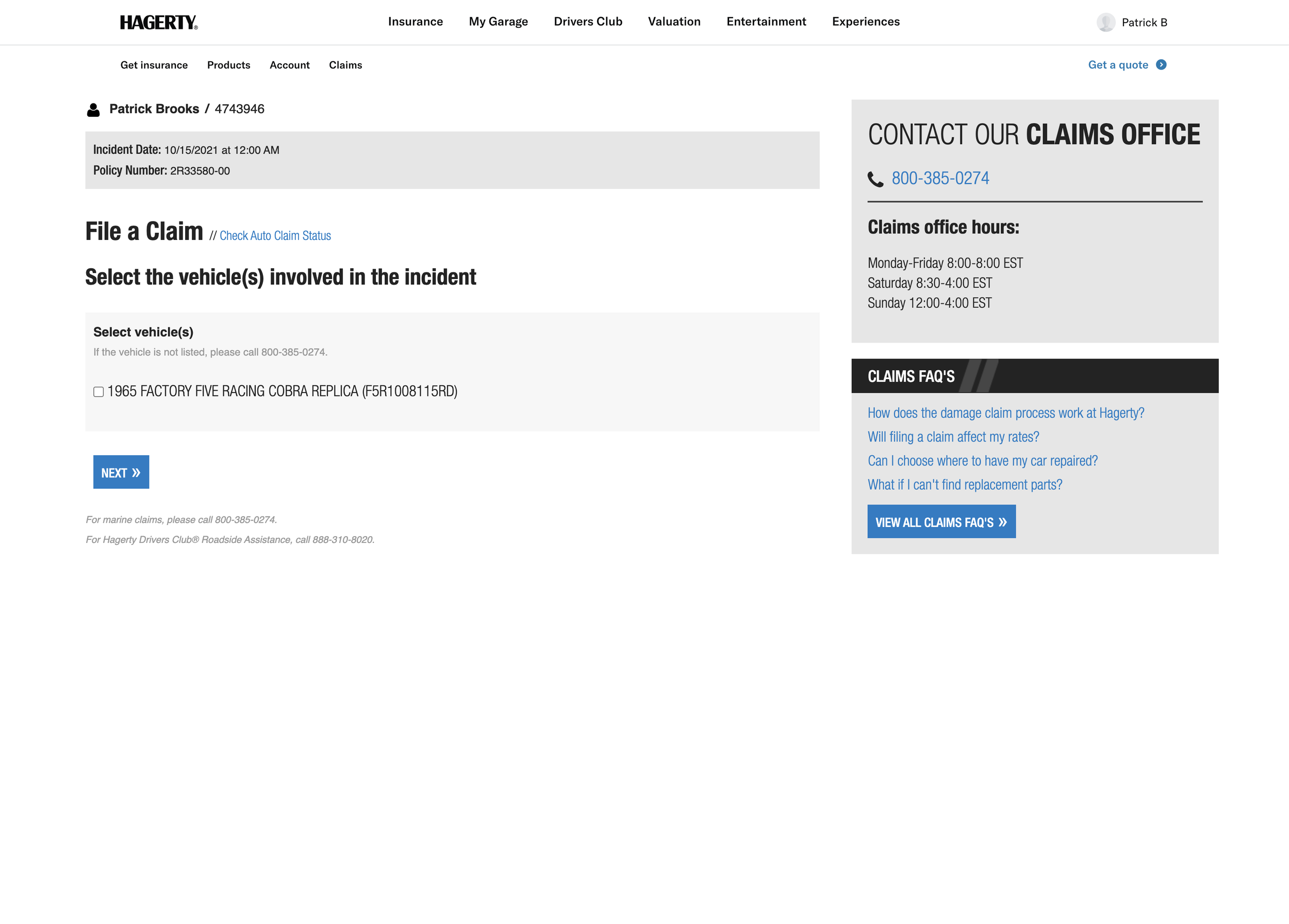
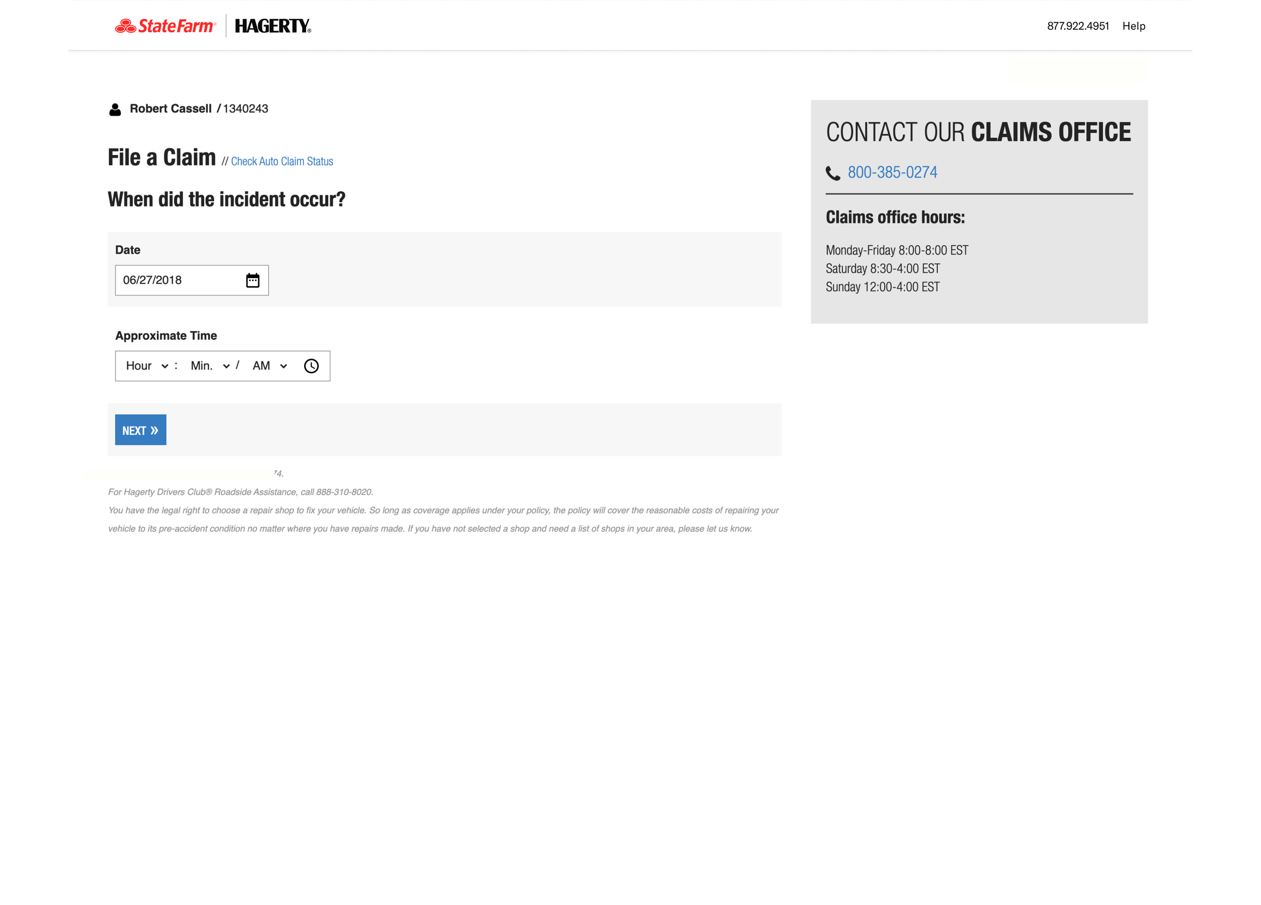
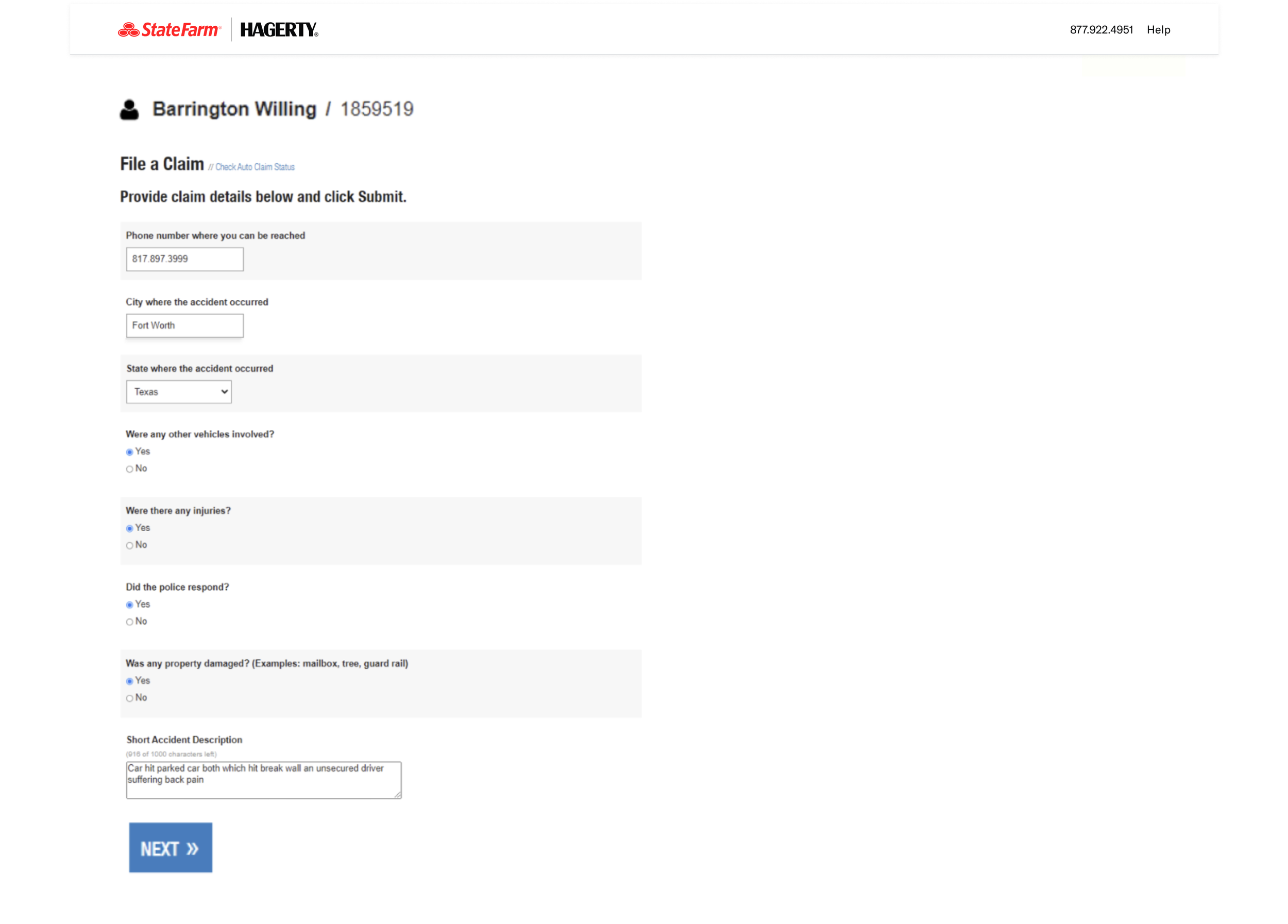
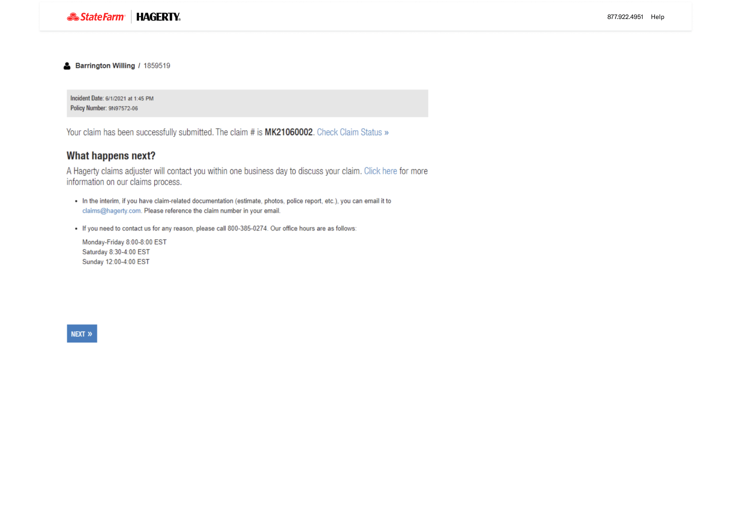
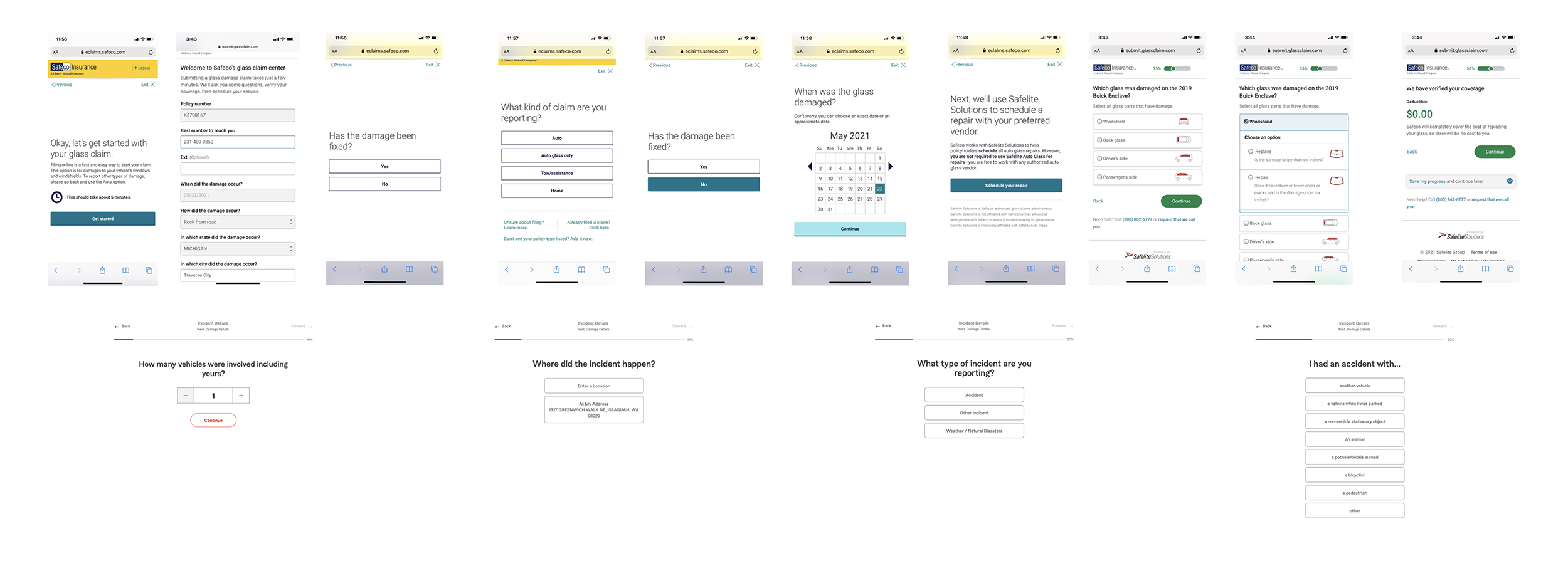
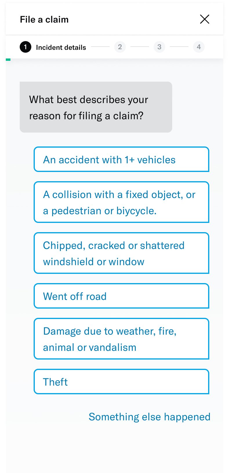
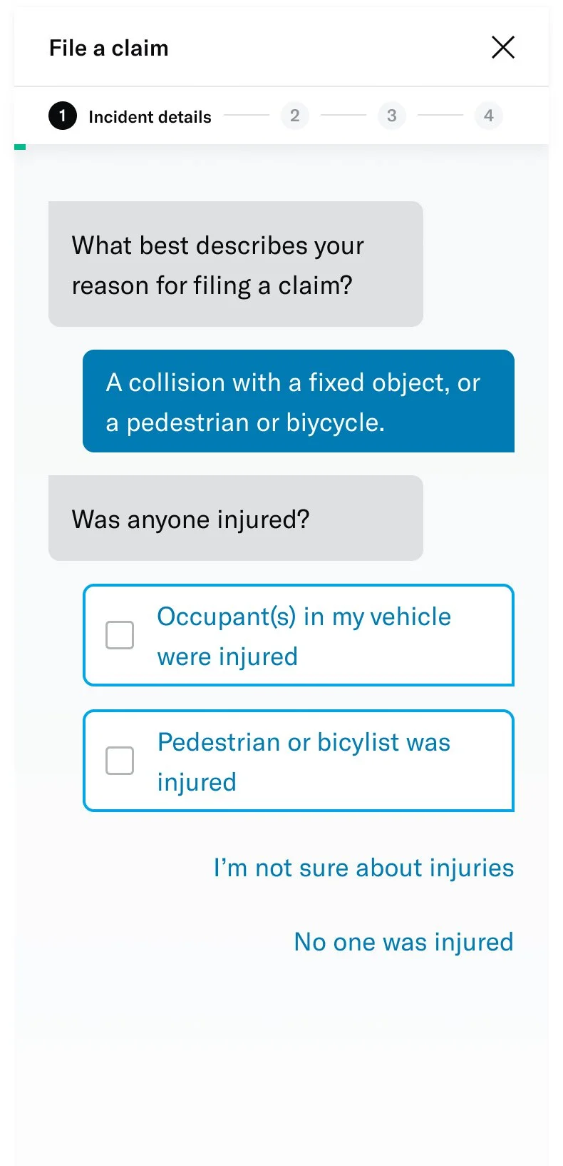
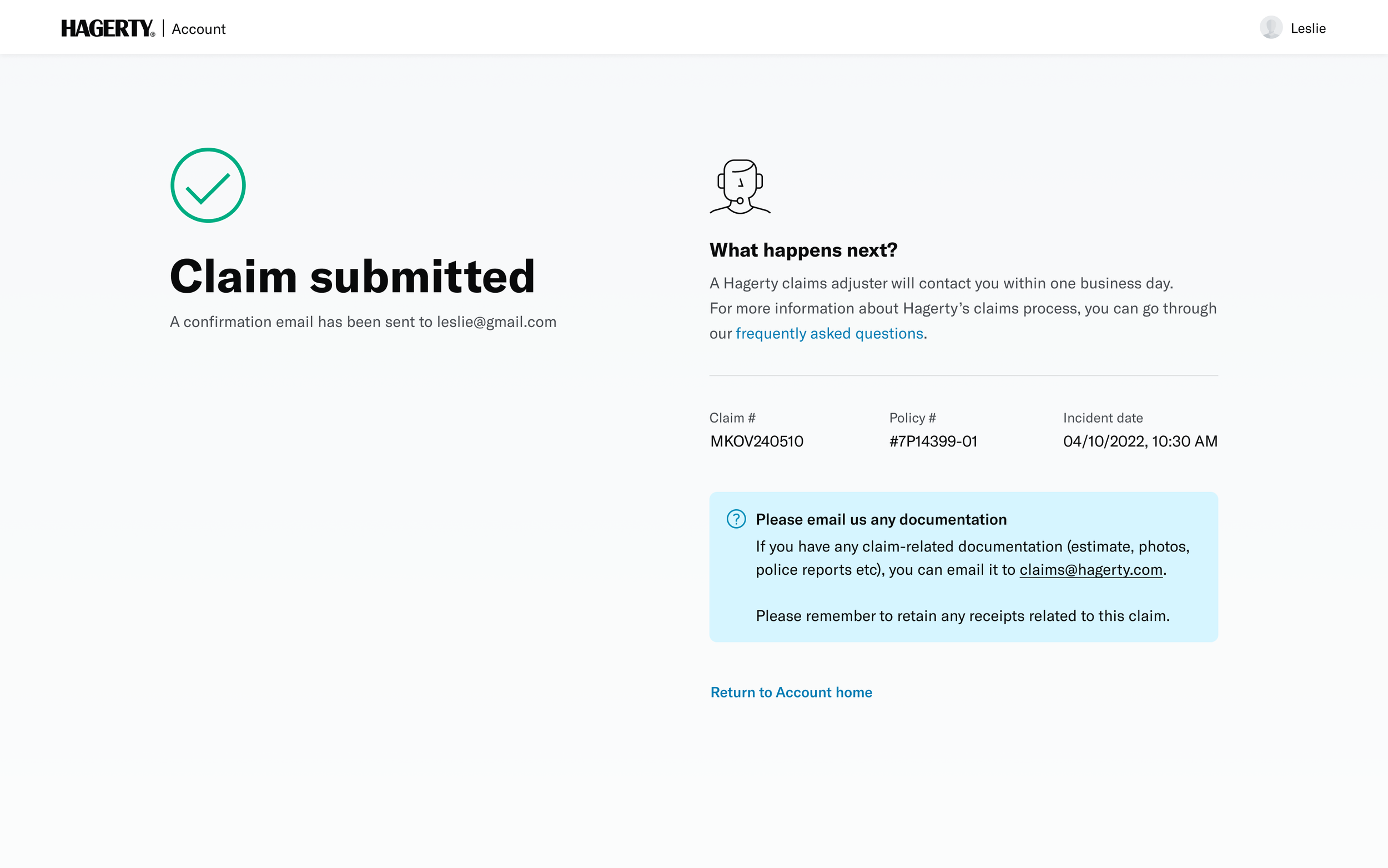
↓ Screenshots of the existing form ↓
Problems
We took the opportunity to look into the entire claims process, and decided to start with the member’s experience of filing a claim online. With insights from stakeholders, we identified some key problems where the business was being impacted.
#1 Information being collected was not enough
The existing web form was easy to use, but did not solicit detailed information from members. In fact, members were expecting to add specifics in order to tell their stories.
#2: Overall claims process was slower and costlier
Since the information collected at the first touchpoint wasn’t enough, it led to adjusters spending too much time on the phone gathering details before any investigation could even begin.
In 2021, about 3,889 claims were filed online and these needed 18,457 outbound calls to learn more about the members’ stories. This cost the business over $212k. This impacted member satisfaction too since their overall claims process was slower.
#3: Low web usage numbers
In 2021, less than 16% of claims were reported online. But the web form had other issues that kept it from being advertised as an option. This created a domino effect of inefficiencies that impacted member experiences as well as business goals.
Goals and objectives
We wanted to define what success would look like for this project. This effort was primarily led by the product team with inputs from the claims team and our analyst.
# 100% mapping of claims
The current system, with its limited information, required manual effort to understand the severity and type of loss for each claim. Through this new experience, where we sought more information from the members, we hoped to classify the kind of claim based on member answers.
# Time/cost reduction
This new experience was expected to reduce the time for manual mapping by the claims team. The metric for this were going to be based on call times with members and employee wages, specifically around the initial claim-filing process. The claims team lead was expected to work on estimating this KPI.
# 5% increase in web-filing
Our team had an overall goal of increased web usage by 5%. Those metrics also applied to the new features we were building. Going in, we were aware that this particular metric would be influenced by discovery of the web-form and any advertising related efforts to ensure members find their way to it (eg IVR redirects).
I tried to ensure that my designs accounted for these metrics that would helped create business impact, while solving member needs.
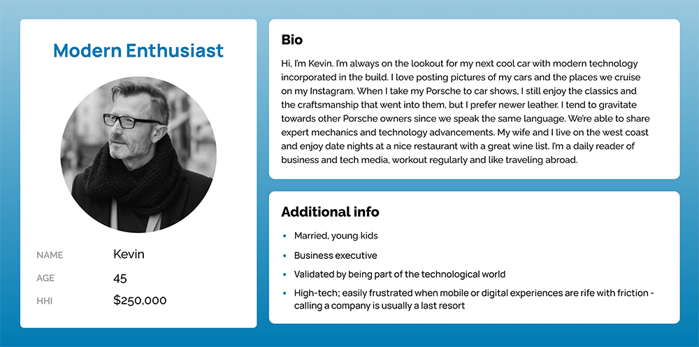
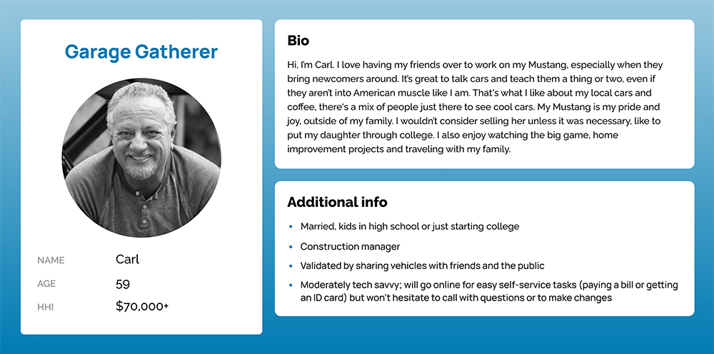
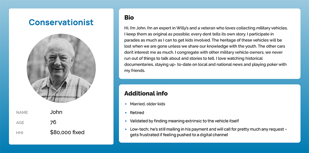
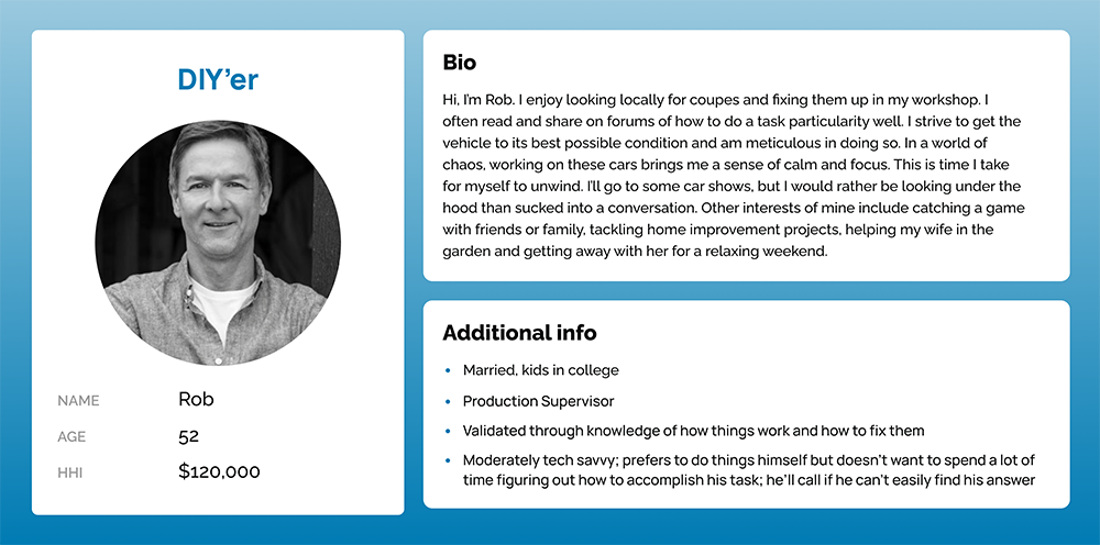
The audience
Our insights team had built a few personas to help describe our member audience. While ever-evolving, about 85% of Hagerty customers were above 45 years old.
While tech-savviness varied from moderate to low, an underlying theme within the group was the preference to have phone conversations. Hagerty’s great customer service center also contributed towards people’s preference to call.
↓ Personas ↓
Understanding the problem space
The topics of insurance and claims were relatively new to me. As part of my discovery process, I sought to get some domain knowledge from multiple avenues to help inform my designs.
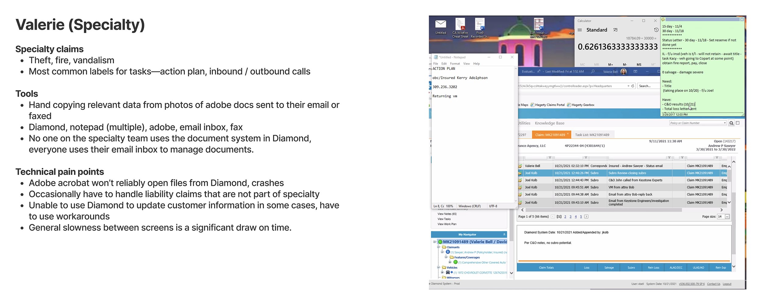
Interviews with claims representatives
First, I wanted to understand how the claims process worked at Hagerty. I spoke to several adjusters within the claims team, specializing in different areas. I learnt about their tools, processes and challenges from the start to closing a claim.
Long term vision
While I had a good understanding of current state, I wanted to understand the business’ goals and visions, specifically around claims. What’s the long term vision and what kind of tech stack are they imagining to increase efficiency and effectiveness within this department.
Competitor analysis
Members of the claims team helped compile screenshots from various competitors as part of background research. This was very insightful reference especially when I began visualizing the user flows.
User interviews
I designed a research plan to help us understand the current member experience around the process of filing a claim. I conducted 5 interviews with members who validated our initial hypotheses.
# Members are willing to provide more details when reporting a claim. In fact, some of them expected it based on previous experiences with other insurance providers.
# Filing online was “doggone easy” for users. This was going to be tricky since our goal of seeking more information would increase the time spent on the form.
↓ Early research and analysis ↓
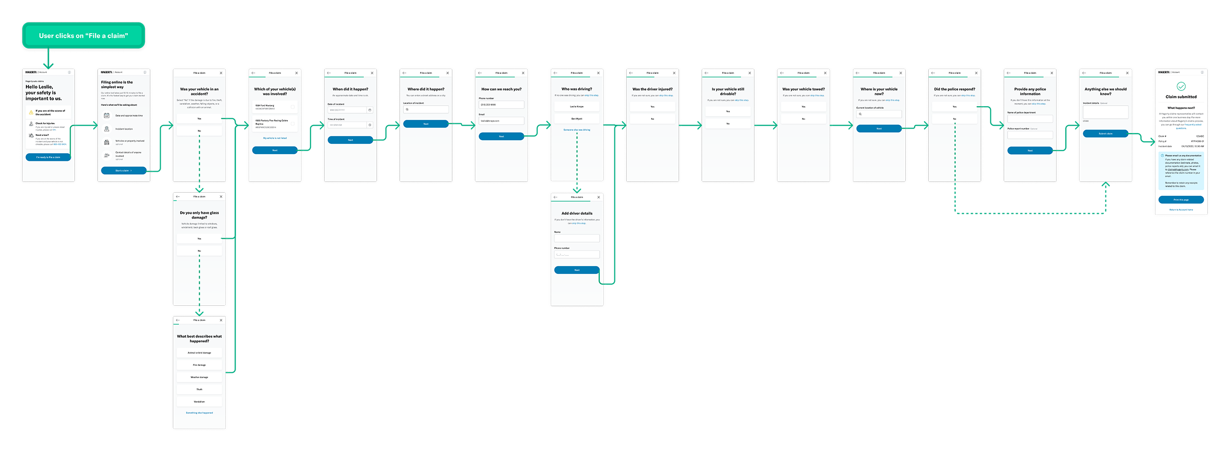
Solutioning
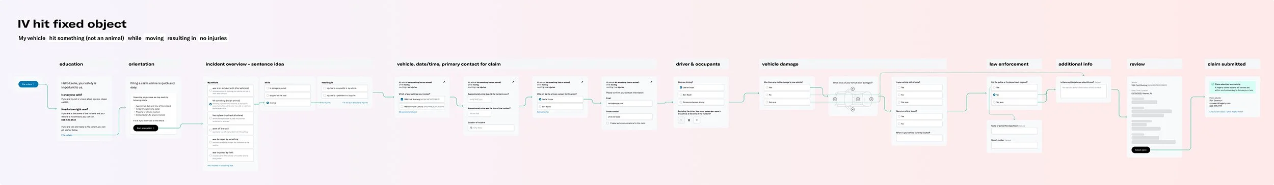
Breadboarding*
Based on findings from the discovery phase, I felt we needed to start by breaking down the information we were planning to collect through the new claim reporting experience. I felt that breadboarding was the perfect exercise for that point in time.
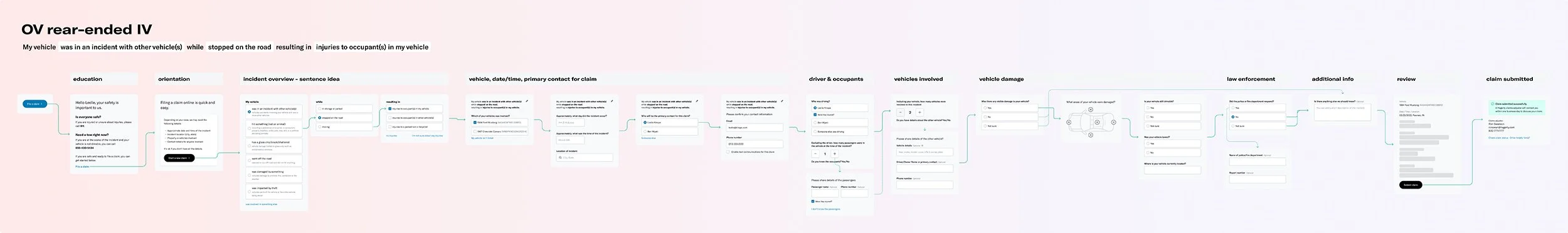
With help from stakeholders, we identified the 9 most common scenarios for filing claims. The goal was to understand how the various components of the flow fit together based on each scenario.
↓ Breadboarding output ↓
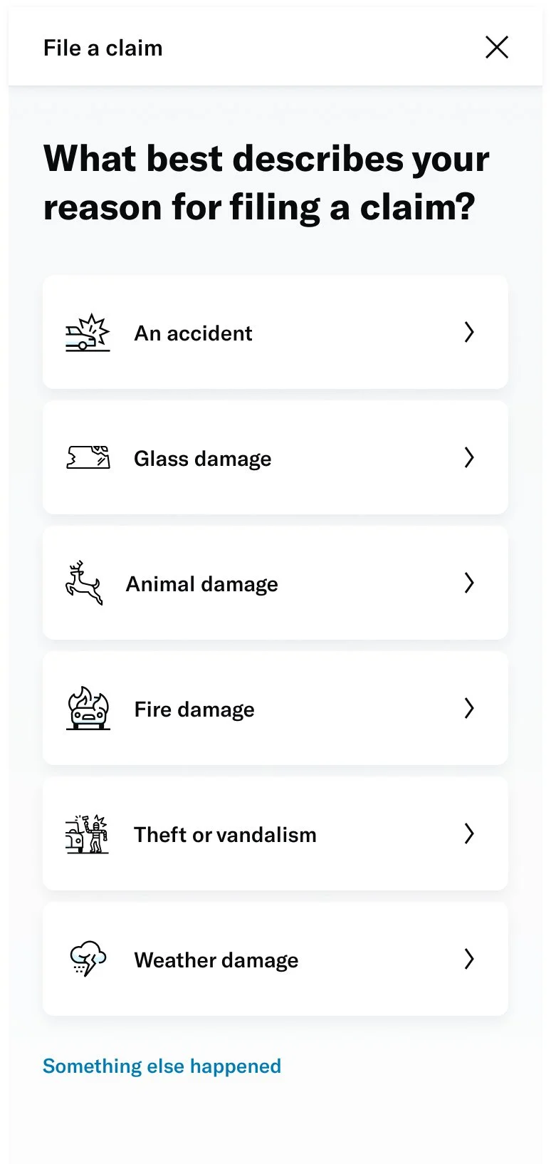
UI explorations
Once we had the components laid out, it was time to begin UI explorations. Based on the context I was designing for, these are some of the tenets I followed:
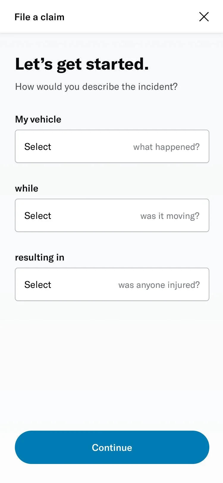
# Strive for simplicity
Insurance can be a complicated topic. Our goal is to use language and iconography that our members will understand with ease.
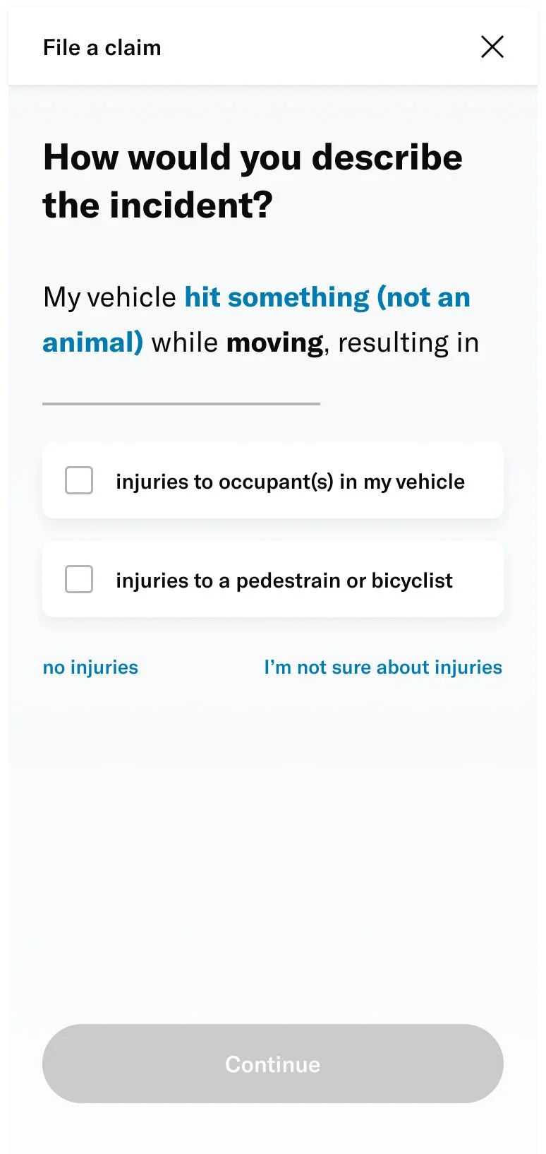
# Remove toil from tasks
Look for approaches that enable the member to complete the needed action as quickly as possible. Build frictionless experiences that prioritize clarity over details.
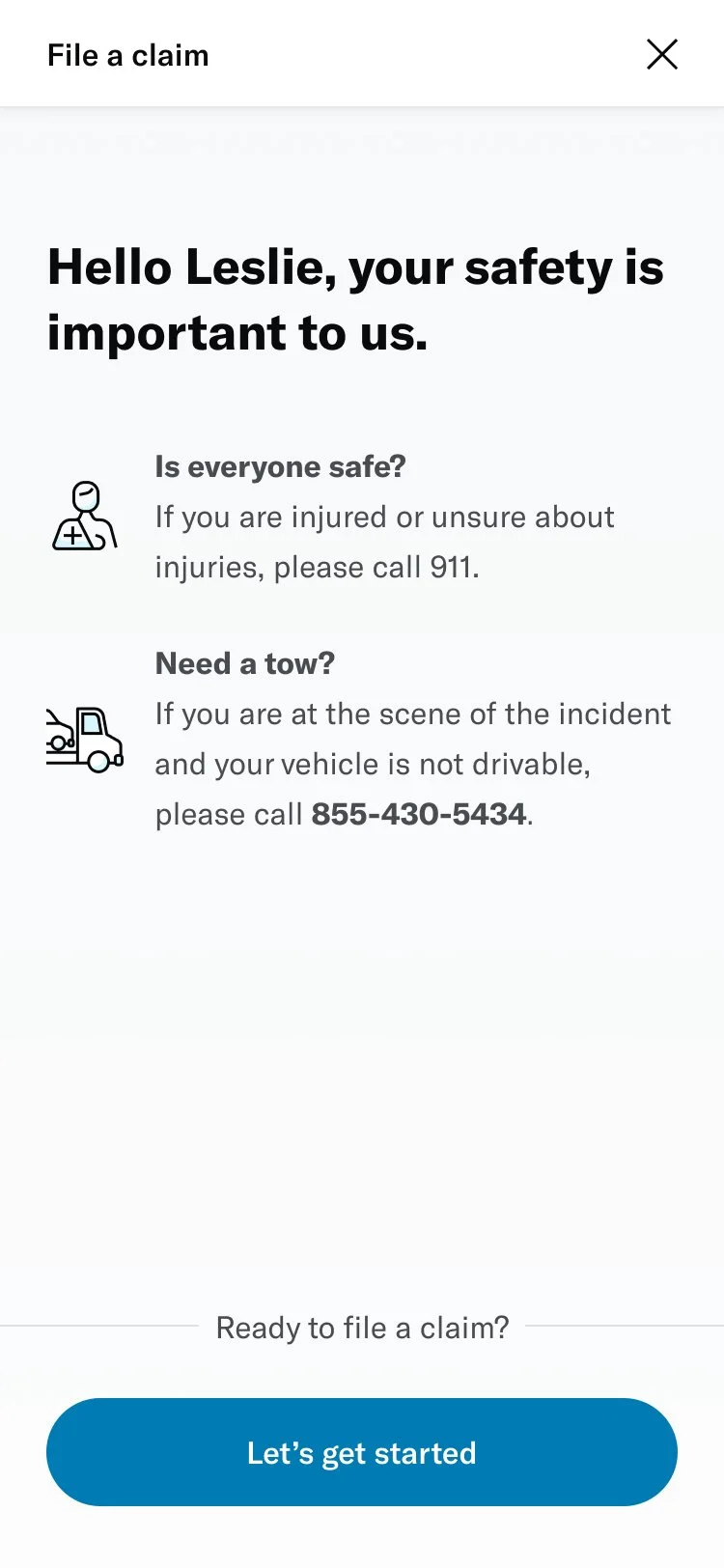
# Be forgiving
Members love their cars and having to file a claim is never something to look forward to. Losses are painful enough already, so our experiences should be kind and thoughtful.
↓ Visual design experiments ↓
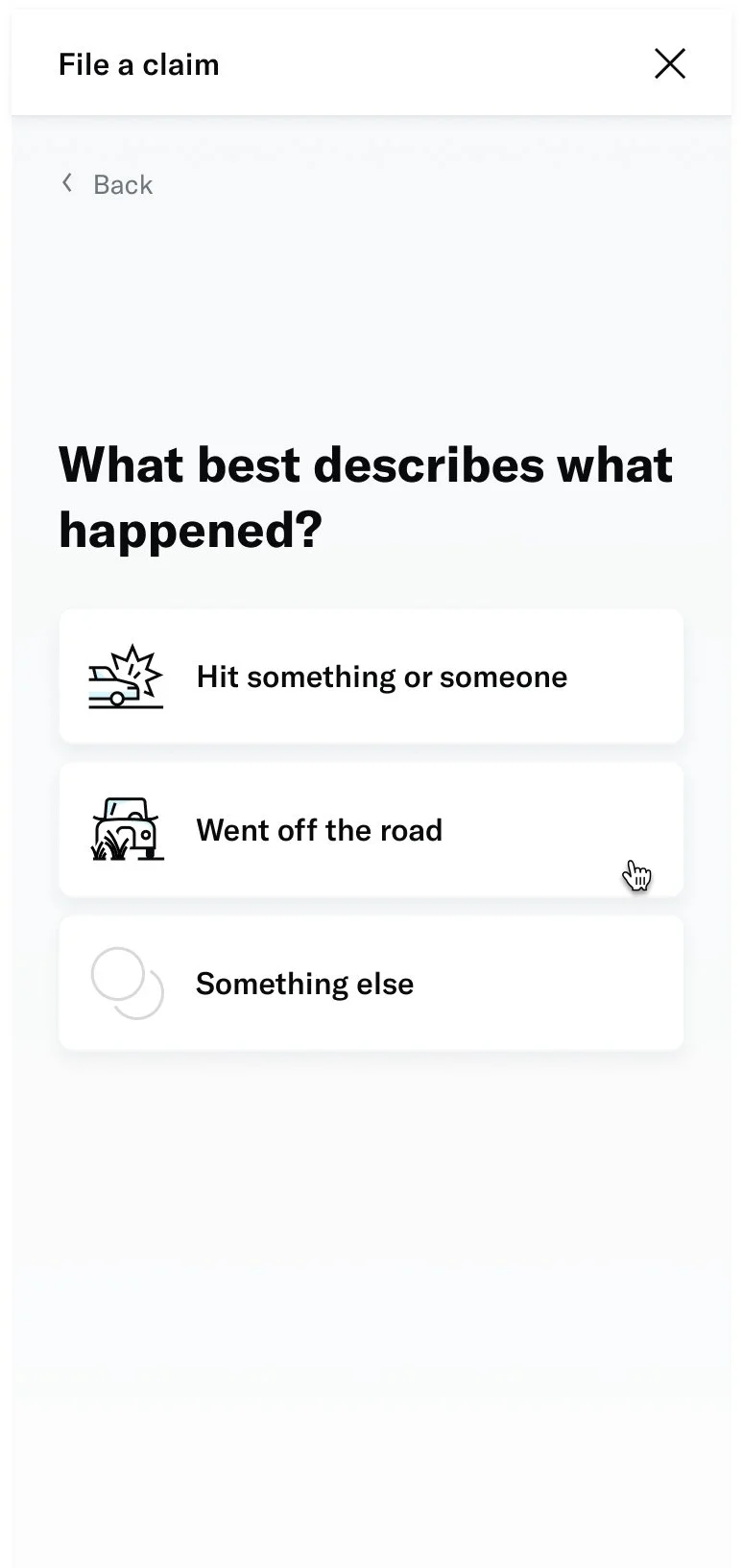

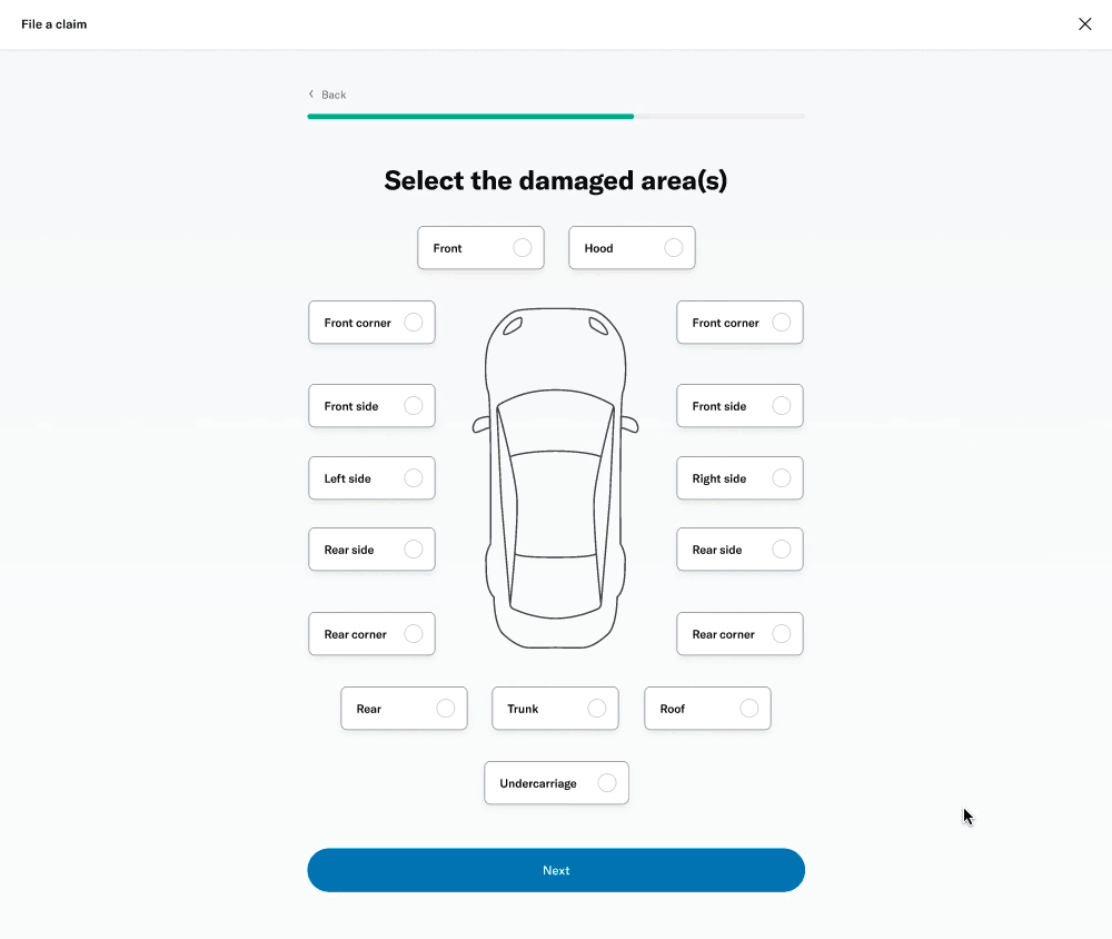
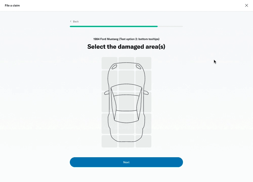
Prototyping
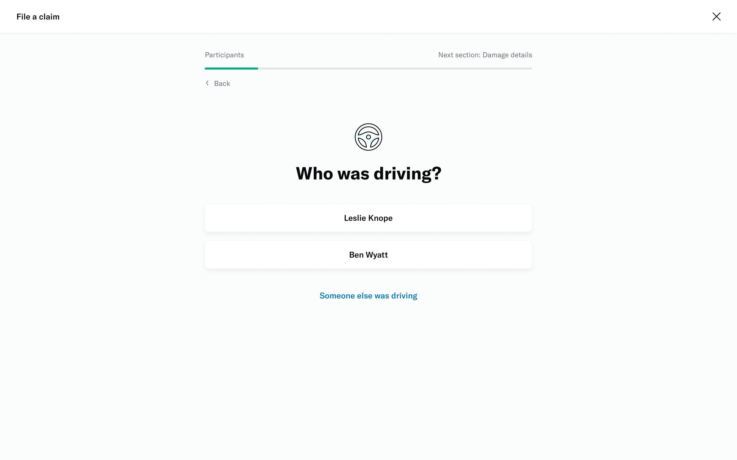
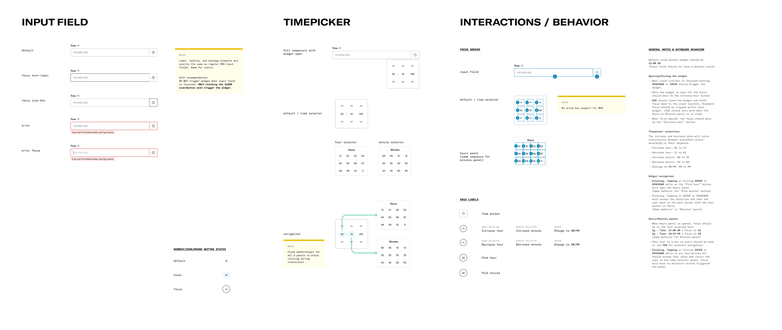
There were some aspects of the experience that could only be illustrated through prototyping. Thanks to Figma’s features, I was able to add interactivity within my designs to get a truer feel of the product.
# Transitions
With the amount of content per page being really minimal, I wanted to build in some page transitions to elevate the experience. This would be really impactful on mobile where it could almost feel like a native app.
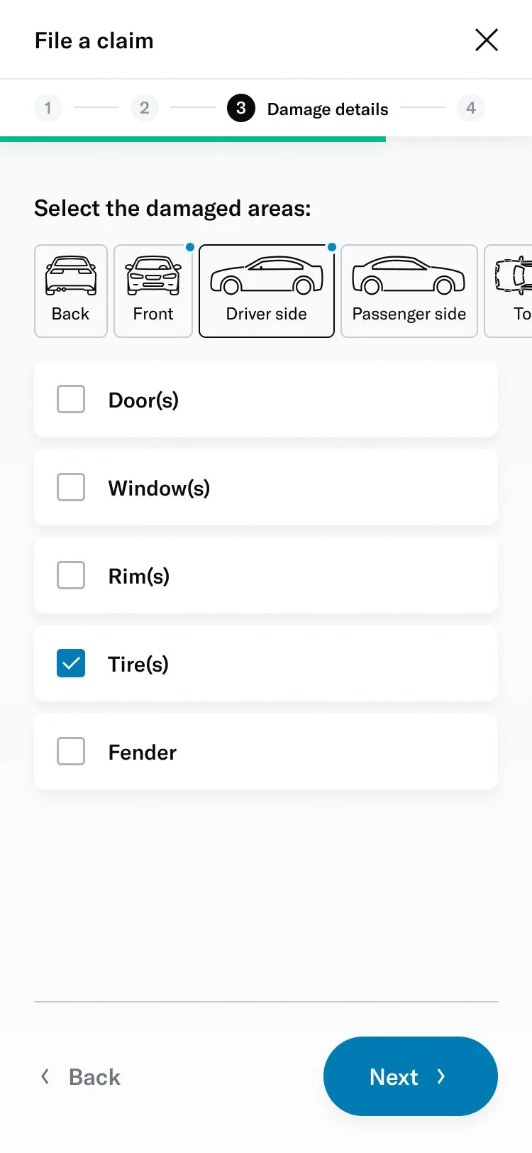
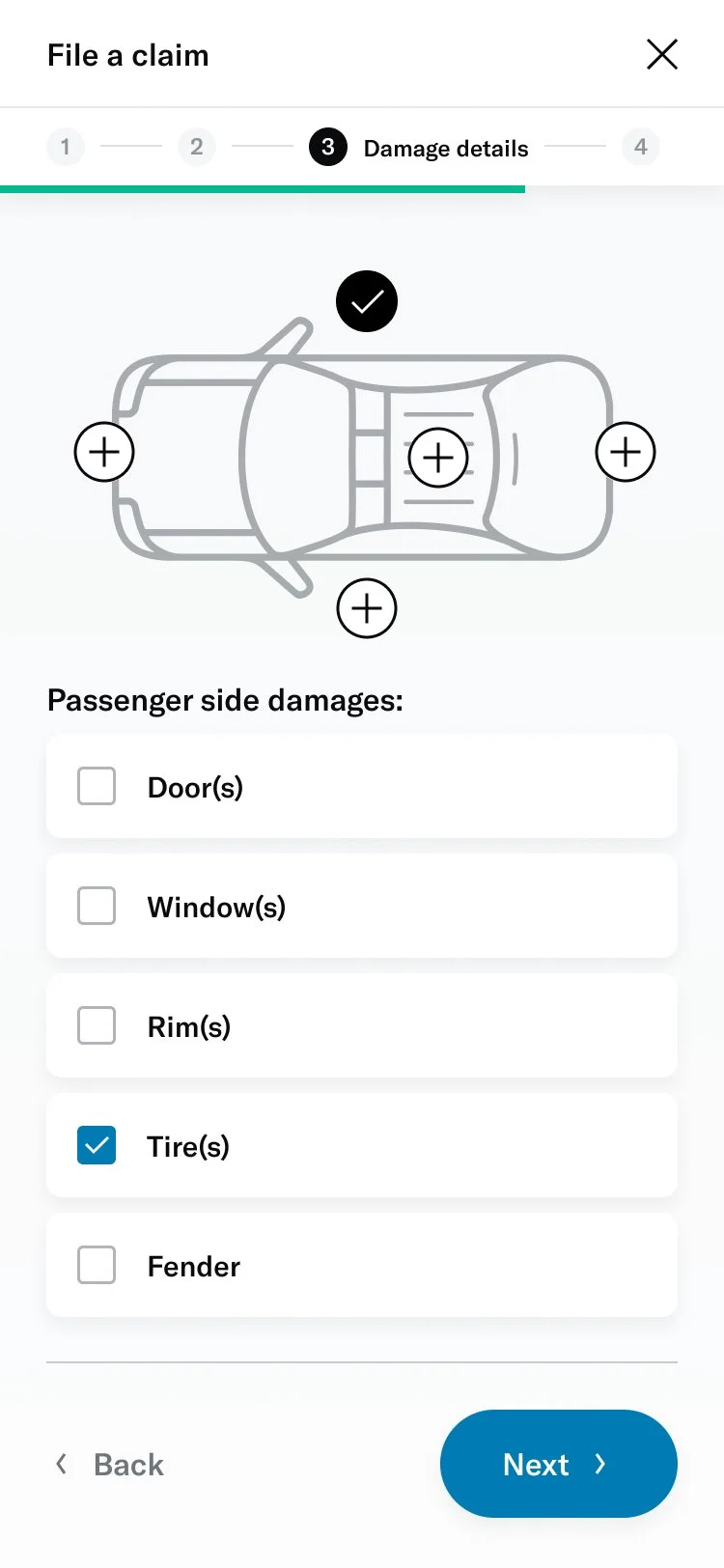
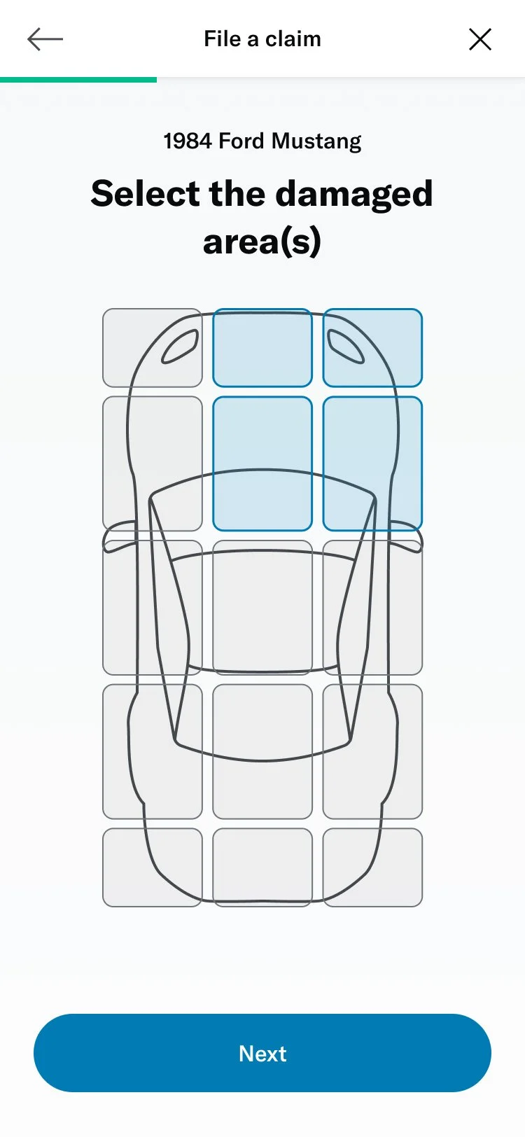
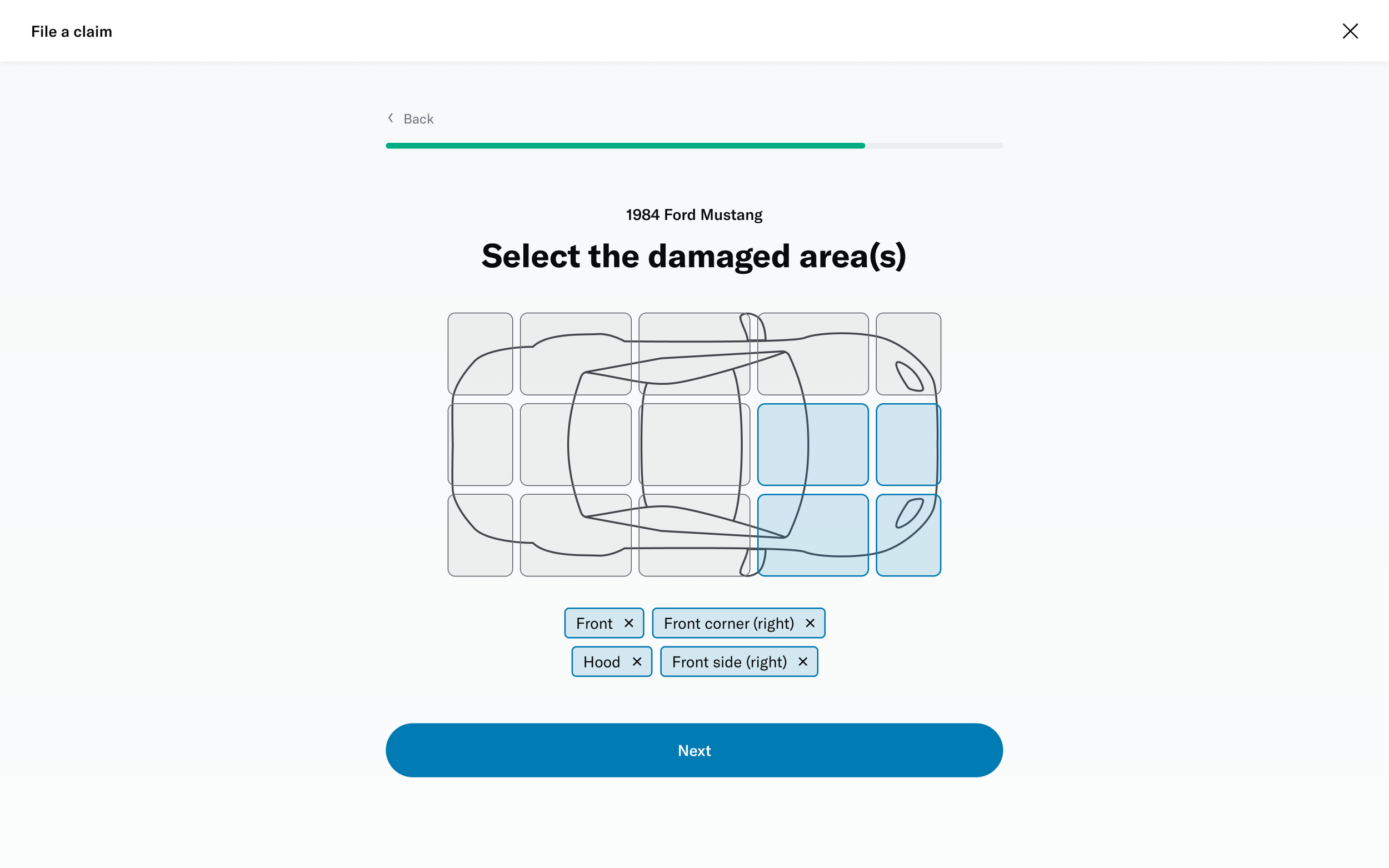
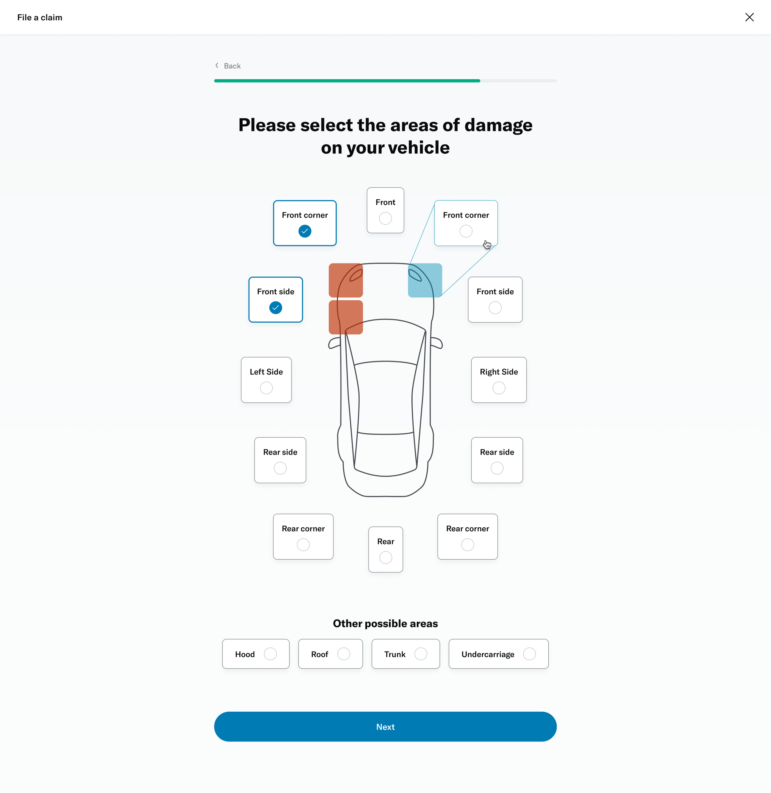
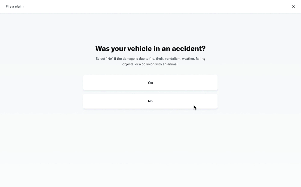
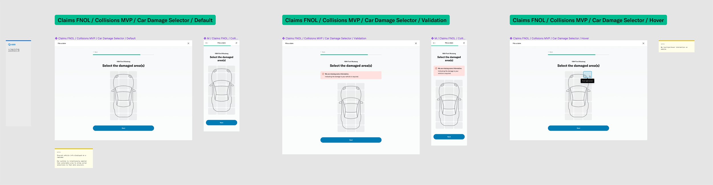
# Damage selector
One of the questions was about selecting the areas of the vehicle that had been damaged. This was challenging because of the advanced interactivity that needed to work on both desktop as well as touch devices. I decided to prototype a few different versions to get a sense of the experience and get feedback from colleagues, stakeholders and members.
I was able to build a fairly advanced prototype that was also used for usability testing.
↓ Figma prototype ↓
Seeking feedback
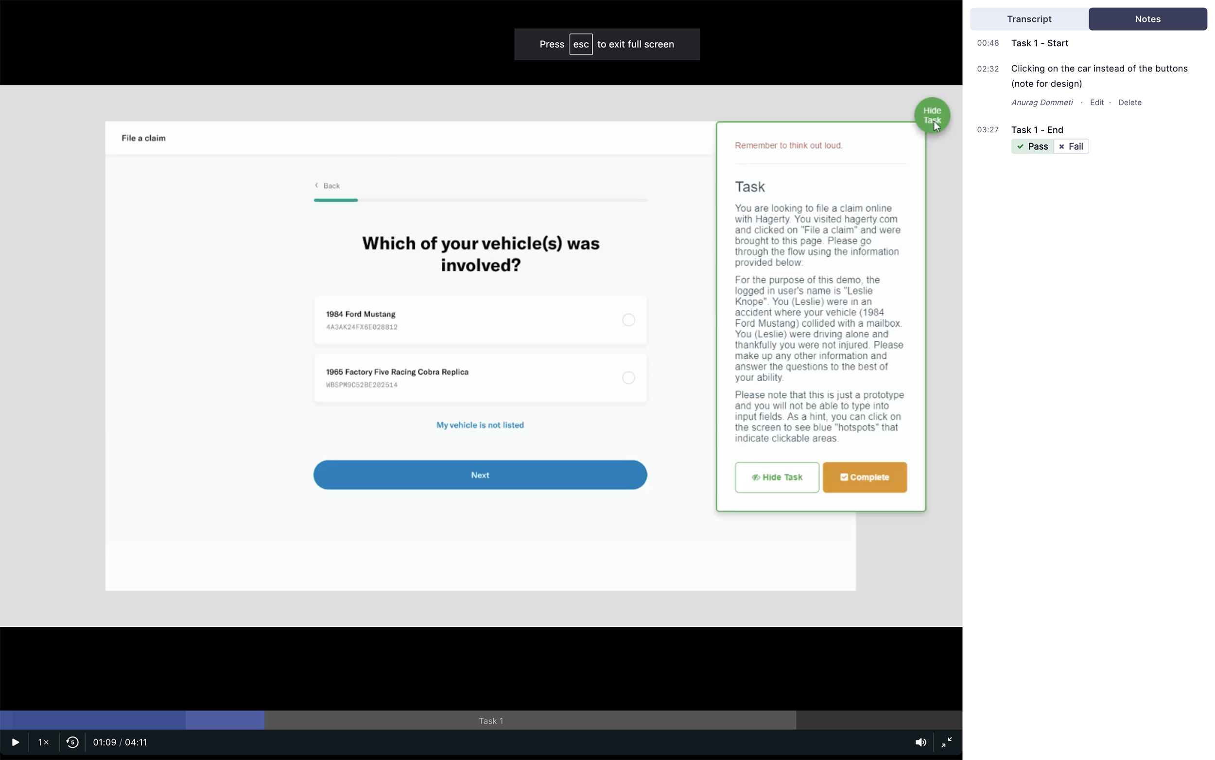
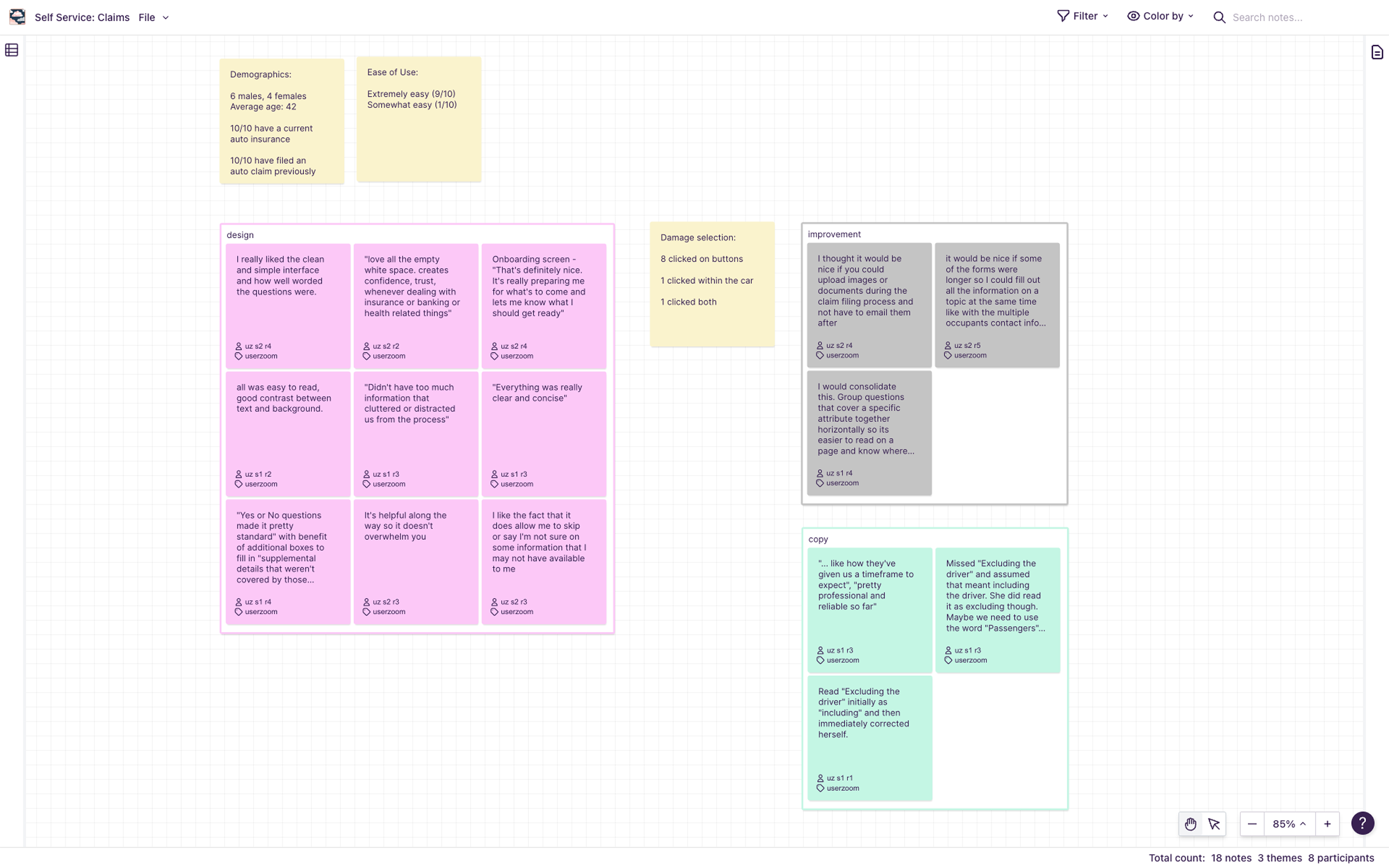
I wanted to make sure our designs were meeting user expectations, if not exceeding them. Since we were increasing the number of questions in the form, I was curious to know if that impacted ease of use. In order to maximize feedback, we decided to pursue multiple avenues of research.
# Unmoderated study via UserZoom
I setup 2 studies within the UserZoom platform based on the Figma prototypes. Each study involved a different scenario for filing a claim as the form dynamically adapted based on user inputs.
There were known constraints within the prototypes since input fields weren’t interactive. But we had sufficient interactivity to enable participants to experience the full flow.
Study 1: File an insurance claim where your vehicle collided with a mailbox
# of participants: 5
Study 2: File an insurance claim where another vehicle rear-ended your vehicle
# of participants: 5
# Moderated study with employees
While the unmoderated studies allowed us to be agile, we also wanted the opportunity to observe users and talk with them as they interacted with the prototype. Our product manager had the idea to get feedback from Hagerty employees who also have policies with the company. This was a good compromise since scheduling was much easier compared to recruiting actual members.
I interviewed 9 such colleagues who were insurance policy holders as well. Over 30 minutes sessions, I went through both prototypes/scenarios with each participant.
18/19
participants found it extremely easy
5/9
loved the damage selector UI
“Each screen was clear and concise. I didn’t feel overwhelmed”
“It was really easy. Asked specific questions without being too demanding by any means.”
“Flow is perfect, it's short. flowed very easy. It's exactly what I'd want to see.”
“All was easy to read, good contrast between text and background. Just had no issues at all.”
↓ Research and analysis ↓
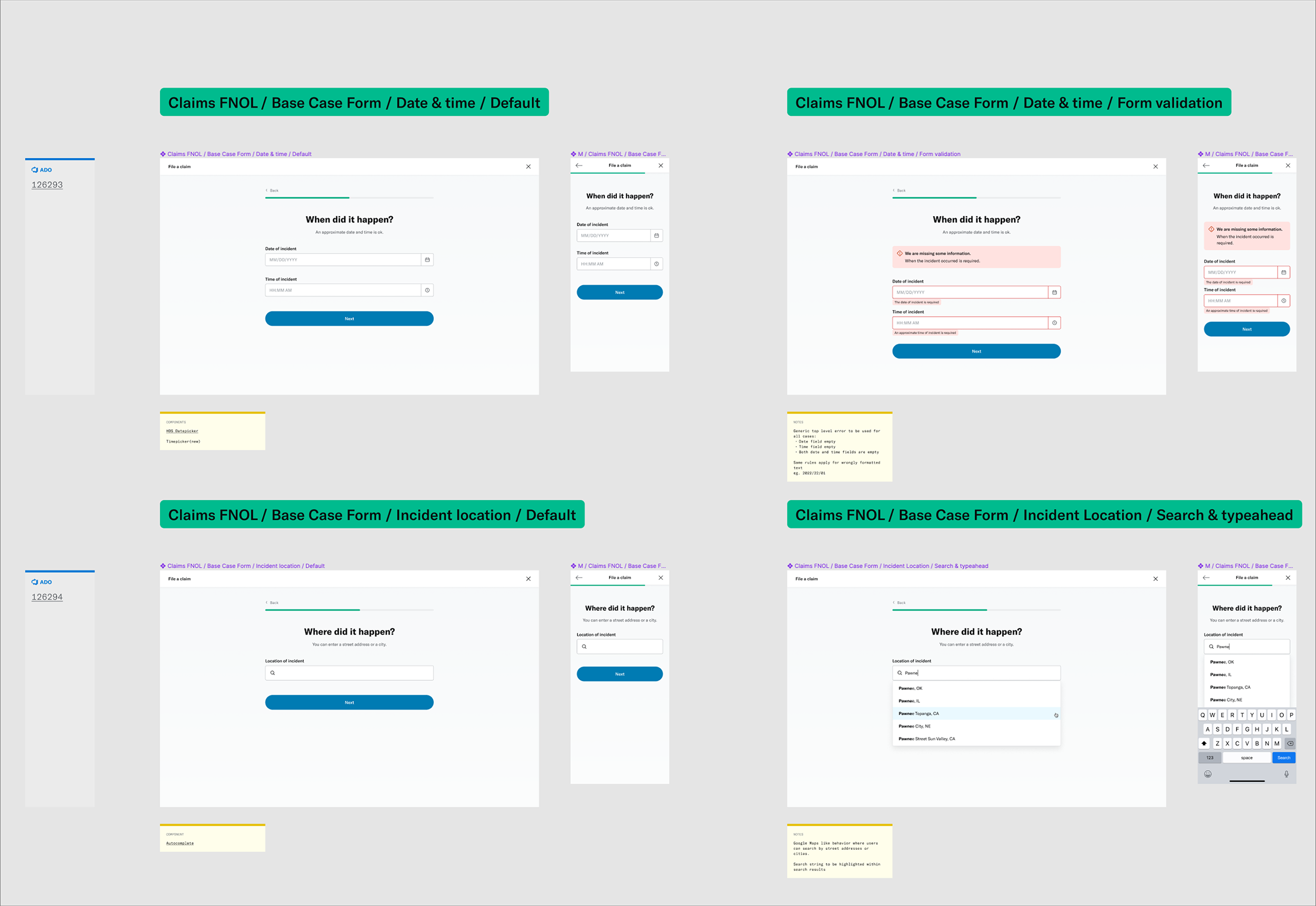
Iterations and handoff
I got some great results from the research, with the main recommendation being around microcopy improvements. I worked with a copywriter on the team to tighten things up before preparing the files for our developers. Figma’s “Inspect” was really handy for this stage of the process.
Our team had a template for spec files that included the overall flows, different states for each screen (loading, errors, etc) and components as needed.
In my attempt to make things easier for developers, I proposed a couple of improvements to better align my work with their agile roadmap.
# Versioning
While the entire web-form was planned for MVP, it was broken down into phases within the scrum calendar based on various factors. I tried to mirror the same breakdown in my Figma spec file by building each phase as a separate page.
# Linking tickets
I made sure to include links to Azure DevOps tickets relating to each screen in the flow. This was helpful for both the developers and me whenever we needed to communicate within the ticket.
These were just initial recommendations that were well received by the team. I hoped to learn from them and continue making improvements to help connect information better and hopefully make things a bit more efficient.
↓ Spec work in Figma ↓
Planning for next steps
With the designs complete, it was time to work with the product managers and analyst on figuring out the next steps.
# Data monitoring
Led by the product analyst we analyzed the various data points we needed to track within the new claim filing experience. We wanted to make sure these related to our KPIs outlined earlier in the project.
# A/B testing
We had been following an experiment based release workflow where a controlled group of members were presented new experiences. This experiment was to be closely monitored over the period of few weeks and adjusted based on incoming data. For this new claim filing experience, we had planned a release for Q4 of 2022.
# Feature planning
Besides setting up tracking for what was built so far, we also began looking at what’s next. In terms of the overall claims process, the next thing to tackle was the process after a member has filed a claim. This involved receiving photos and documents and communicating status to members.
The work was really just getting started within the claims space!